Get in touch
hello@stymix.com
Making even small changes in digital marketing can lead to astonishing results while big changes may not be that much impactful. So, it's ok if you get confused while experimenting. But it's not ok to stop trying.
A/B testing is one of the most powerful methods for choosing what works best. See how A/B testing can impact web designing. You can literally do this for most of your business elements including design, development, and marketing. So here, we've listed 9 A/B testing examples that might inspire you take the next step.
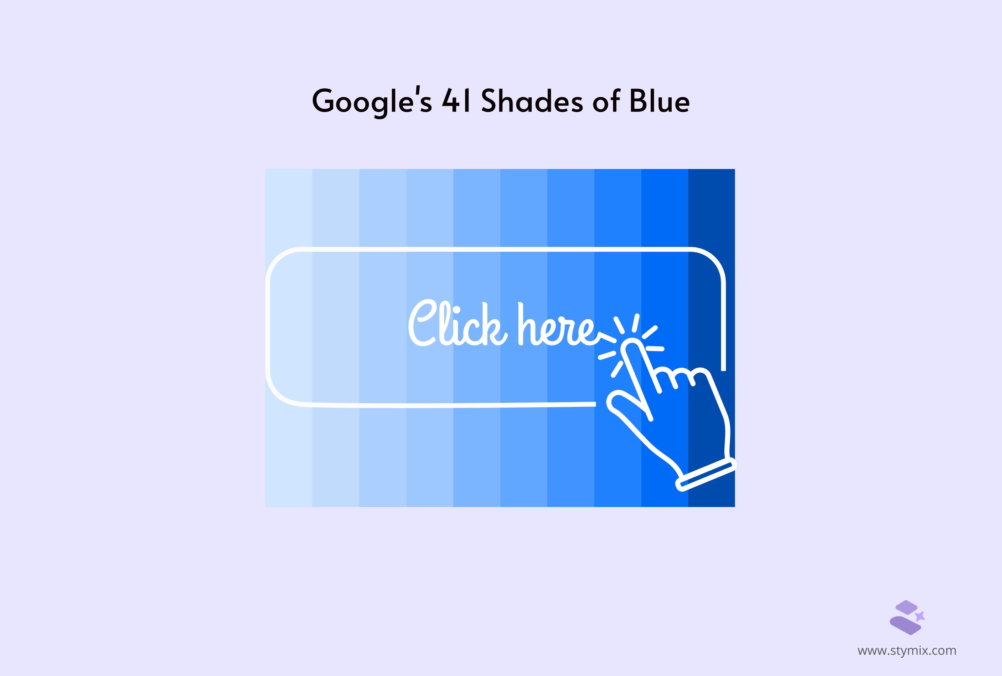
Google always aims to optimize its user experience and maximize revenue. So, it decided to focus on a seemingly minor detail: the color of its advertising links.
Problem:
The problem was identifying which color would result in the highest engagement from users.
What changes they made:
To do so, Google conducted a split test with 41 shades of blue. The idea was to find the exact shade that would draw the most clicks. Therefore, it would increase revenue.
Result:
And the results were astounding. The optimal shade of blue led to an estimated $200 million increase in annual revenue!
This A/B testing example highlights how even minor changes can significantly impact the conversion rate and the bottom line.
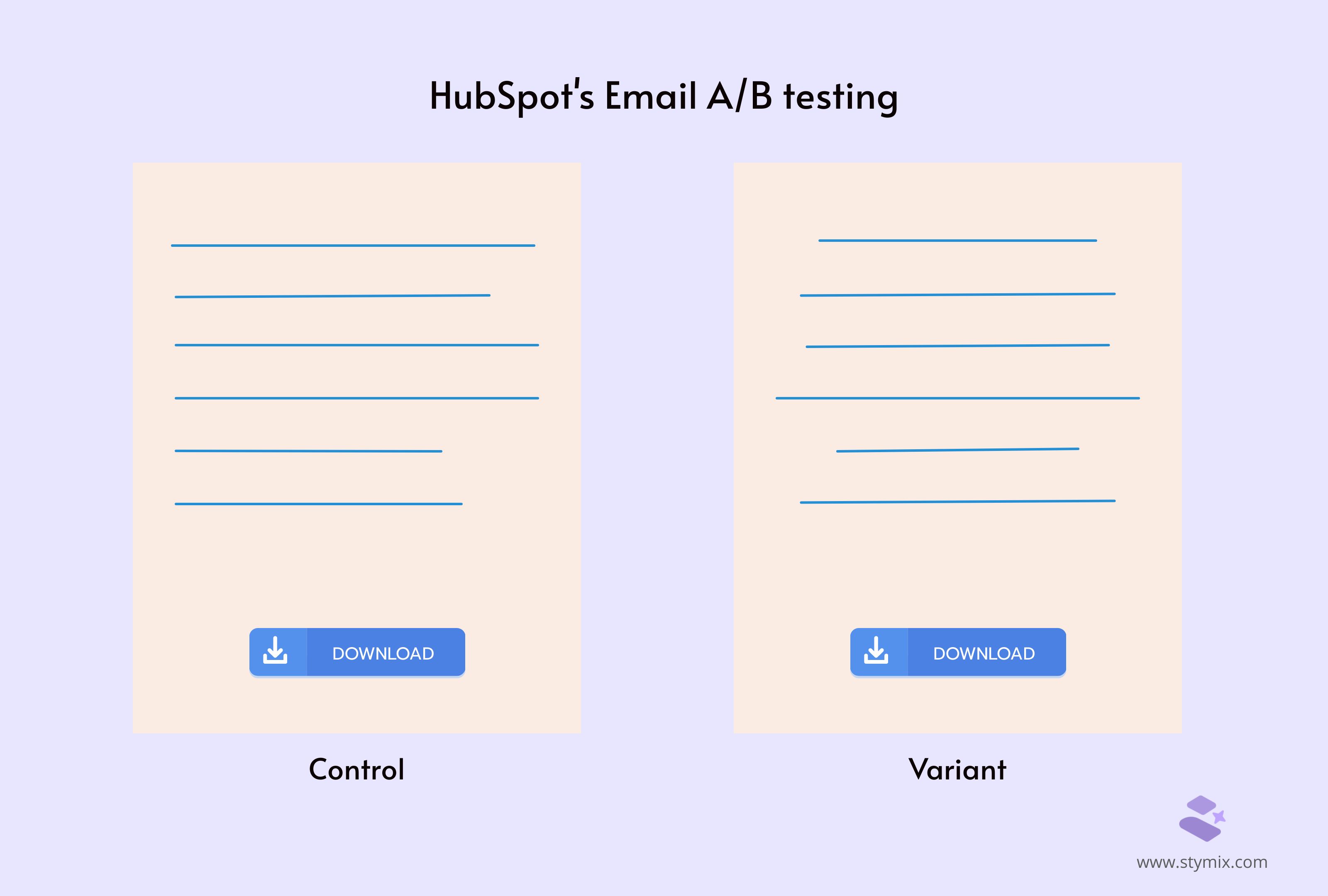
HubSpot is one of the well-known digital marketing platforms who always prioritizes user interaction. In one of their experiments, they decided to solve the issue of low click-through rates on their weekly subscriber emails.
Problem:
HubSpot presumed that the email text alignment might be the problem. Maybe it was affecting user interactions with their call-to-actions buttons or CTAs.
What changes they made:
To test their hypothesis, HubSpot did an A/B test comparing two formats:
Result:
The experiment brought some unexpected outcomes. Contrary to their hypothesis, the emails with left-aligned text performed worse than the centered text.
In fact, less than 25% of the total left-justified text email performed better than the centered one.
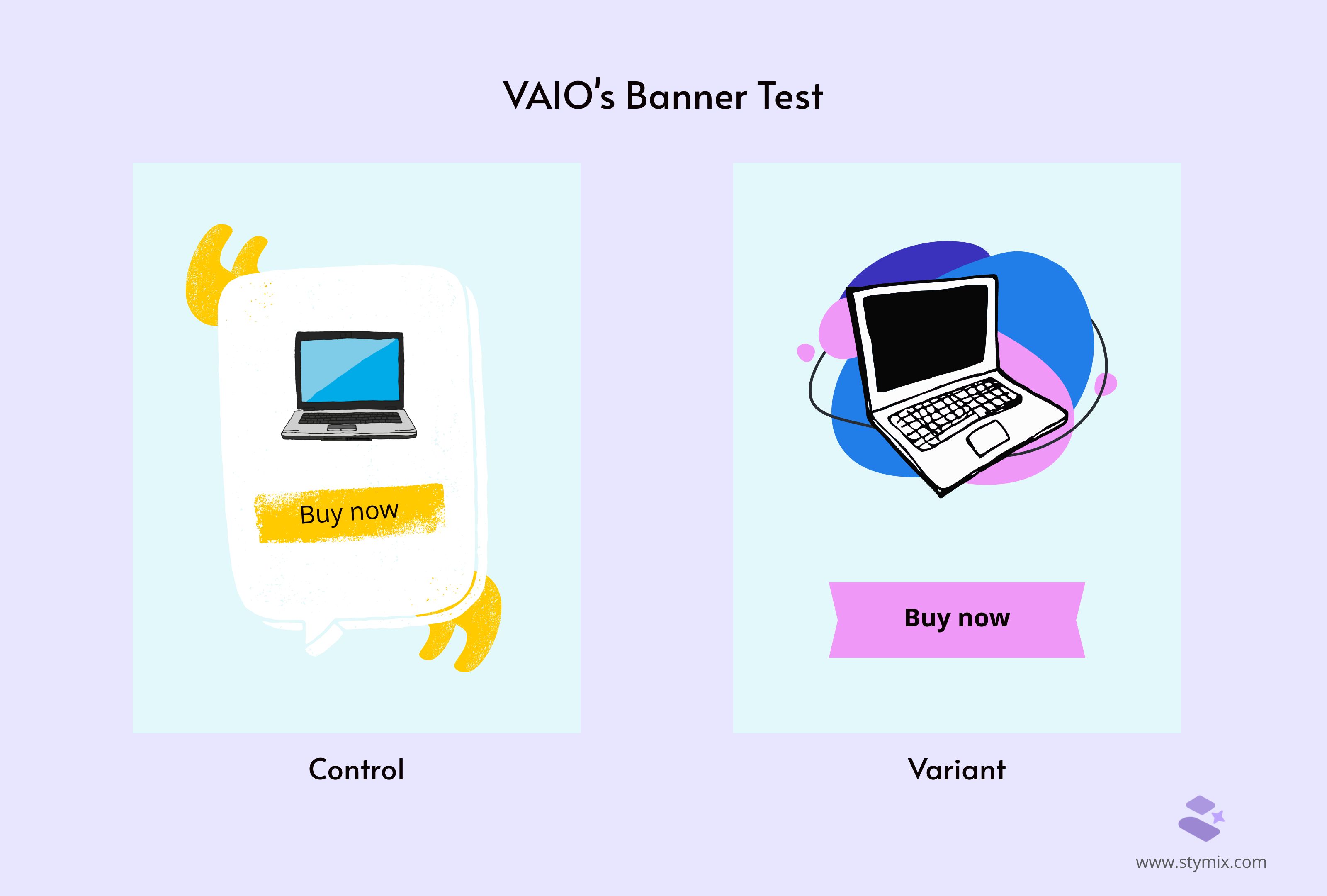
VAIO, one of Sony's former brands, is renowned for its innovative technology. It continually seeks to enhance user experience through strategic testing and optimization.
Problem:
One of VAIO's experiments was the banner of their VAIO laptops' ad. They aimed to see what works best for their campaign and which version had the highest number of shopping cart ads.
What changes they made:
They tested variant A (control), VAIO's original banner, and variant B, VAIO's variation banner.
Result:
It was far better than expected with the variant. It improved the CTR by 6% compared with the variant A. Even the shopping cart ads rose by 21.3%.
Considering these numbers, it's visible how much value they generated for their banner by simply A/B testing.
Initially, VAIO's marketers thought emphasizing customization might cause customers to reject the offer. They believed it could be a possible disturbance while making the purchase.
Their AB testing proved their initial idea completely wrong, making it one of the good marketing experiment examples.
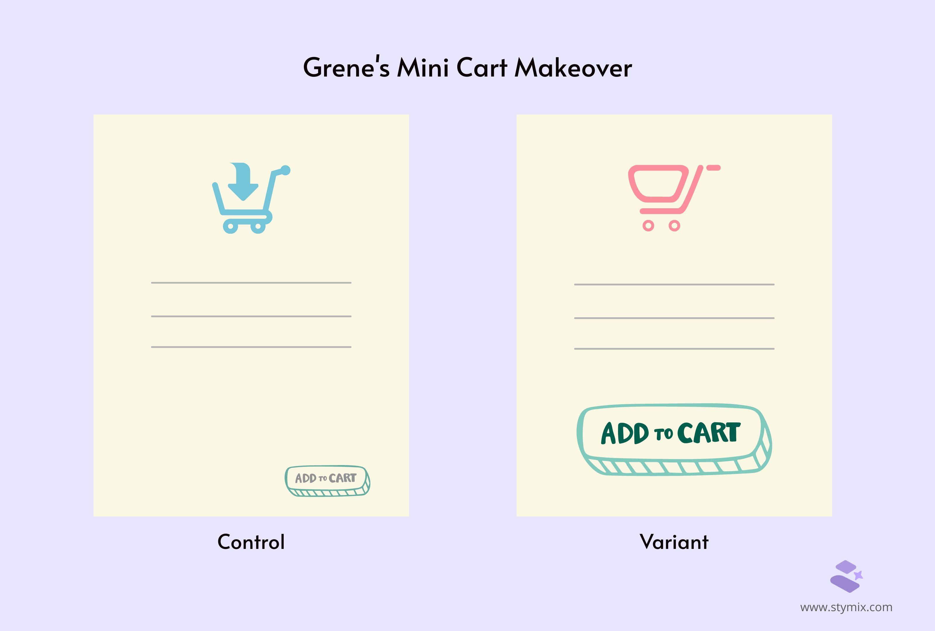
In the competitive world of e-commerce, even small changes can make a big impact on sales. Grene, a major player in Poland's agriculture e-commerce, discovered this when they updated their mini cart.
Problem:
What changes they made:
Results:
After the makeover, more customers clicked through to the cart page. Grene's e-commerce conversion rate increased from 1.83% to 1.96%. Even better, they doubled the quantity of goods purchased—talk about a significant increase in sales!
Grene's mini cart makeover shows how well thought out improvements in the shopping journey can lead to big results.
WorkZone is a software company that helps teams manage projects. They wanted more people to sign up for product demos. They had a page where customer reviews were shown next to the sign-up form. However, they noticed a problem.
Problem:
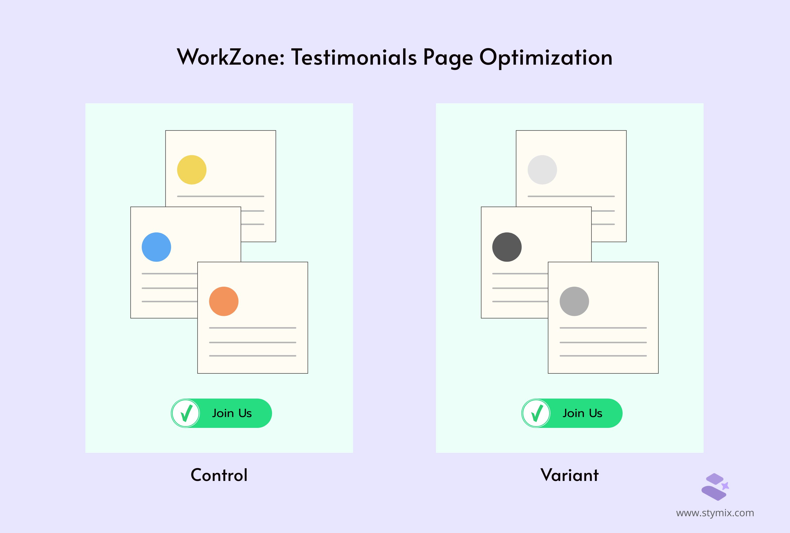
The colorful logos of these reviews were grabbing too much attention. They believed it was possibly distracting visitors from filling out the form.
What changes they made:
WorkZone decided to try something different. They ran an A/B test where they changed the logos from color to black and white. This simple change aimed to make the page less distracting. This way, it could focus more on getting people to sign up.
Result:
They saw some exciting results after running the test for about three weeks. The version with black and white logos led to a 34% increase in people signing up for demos!
This change was really significant. It shows that even small design tweaks can make a big difference in getting more customers.
This example is more of a copywriting test than design. A popular online education platform, Codecademy offers free coding courses in different programming languages. Their free courses are mainly for beginners. However, their pro plan is better for people who want to get advanced learnings than just the basics.
Problem:
Codecademy's AB testing experiment was about their pricing page.
What changes they made:
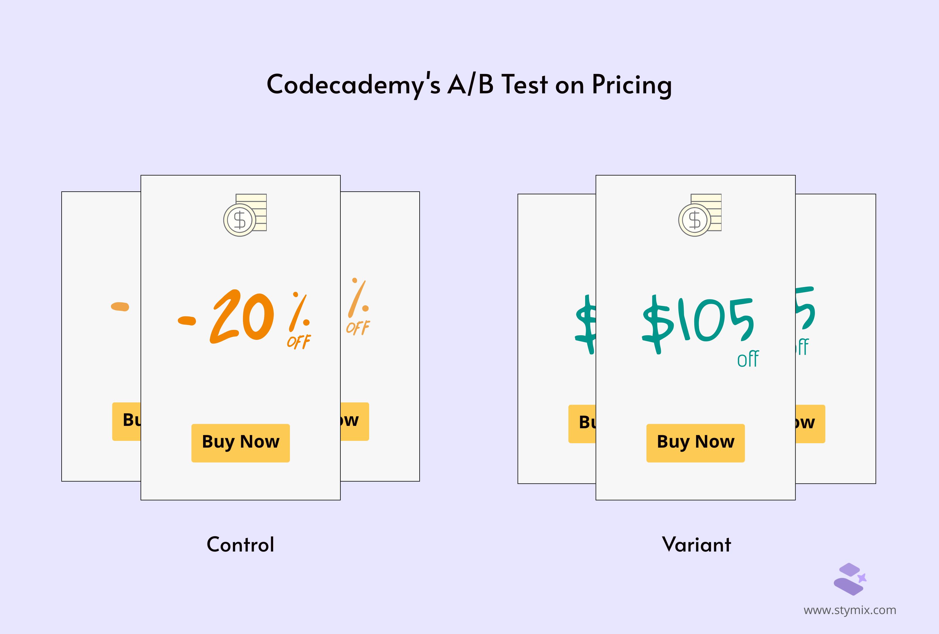
They applied the 'Rule of 100'. It suggests people perceive dollar amounts over $100 as more valuable than percentages, even if they represent the same savings or even more. Their annual plan savings were over $100. So, they decided to experiment with a new pricing display approach.
Instead of showing percentage savings, they displayed the exact dollar amount customers would save on the annual plan. Would this adjustment make the savings appear more substantial and appealing to potential customers? Let's see.
Result:
The results of the A/B test were highly positive. The new pricing display format contributed to a significant 28% increase in sign-ups for the annual pro-plan. However, total sign-up was impacted by a very low margin.
Whether as an influencer or for business, staying ahead of trends is very important in social media. Vestiaire Collective is one of those platforms for buying second-hand luxury fashion. The brands' trendsetting on TikTok can be a good split testing example for you to take on.
Problem:
Vestiaire wanted to expand its reach to the new generation of buyers, Gen-Z. So they targeted TikTok. They also wanted their influencer partnerships to be creative and effective in boosting brand awareness and app downloads.
What changes they made:
Vestiaire's team ran an A/B test campaign with influencers to reach its goal. They gave eight influencers the freedom to create different TikTok content forms. Each post had specific CTAs.
After launching the posts, they analyzed which ones performed best using split testing. They looked at metrics like views, likes, and shares to identify the most effective posts. These top-performing posts were then promoted with targeted ads to maximize reach.
Results:
The outcome was impressive. Vestiaire's strategic use of A/B testing resulted in over 4,000 new app installations. Additionally, it significantly reduced the cost per installation.
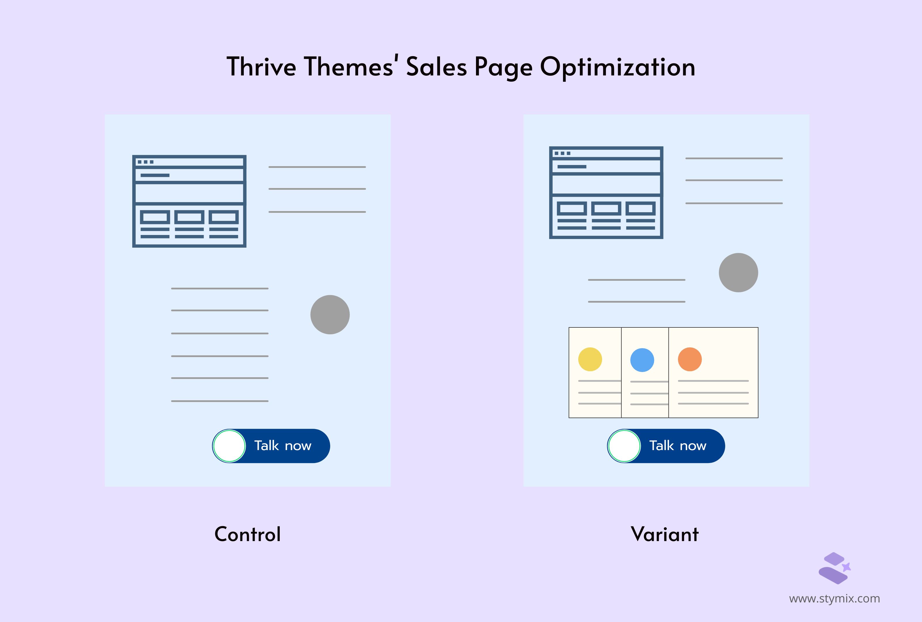
Now, let's look at another experiment with testimonial pages. Showcasing customer testimonials can make a big difference in case of landing pages. Thrive Themes, known for its website tools, realized this and decided to put it to the test.
Problem:
Initially, Thrive Themes had landing pages focused on highlighting product features with a banner. While informative, they wondered if adding customer testimonials could boost sales even more. They wanted to see if real customer feedback could convince more people to buy.
What changes they made:
So, they set up an A/B test. For six weeks, they ran their original landing page against a new version that included customer testimonials. The goal was to see which one would lead to more sales.
Results:
The results were clear and exciting. The landing page with customer testimonials saw a 13% increase in sales compared to the control.
Specifically, the control page had a conversion rate of 2.2%, but the new variant with testimonials jumped to a 2.75% conversion rate.
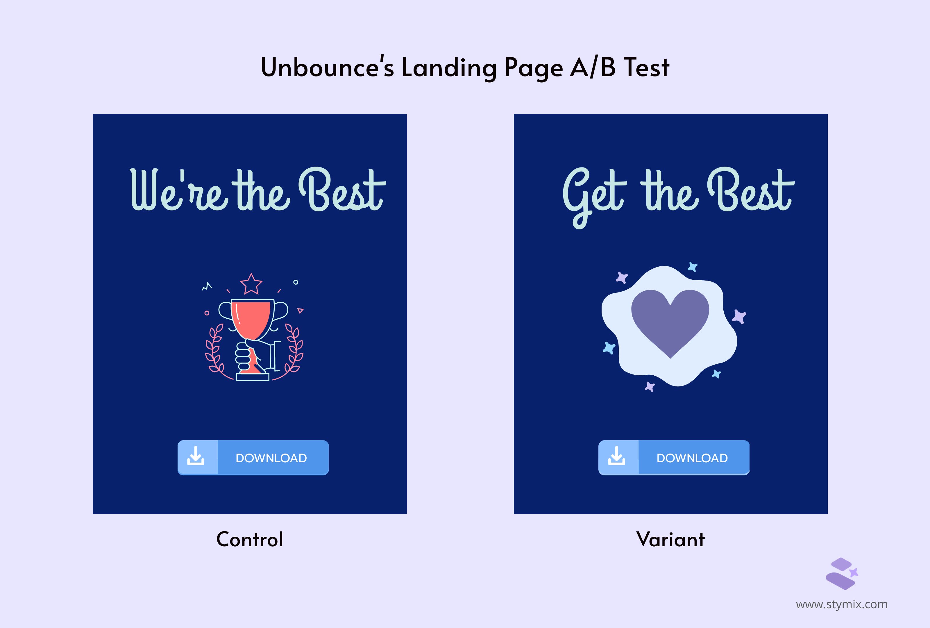
Unbounce is known for creating landing pages that help businesses get more customers online.
Problem:
They wanted to improve their pages by testing how the headline and pictures affect the number of new sign-ups.
What changes they made:
Unbounce thought changing the headline and the pictures could make more people to register.
So, they tried something new. They set up an A/B test with two versions of their landing page:
Results:
The change was a big success! The new headline and picture made 90% more people to sign up than the original page.
This shows the importance of having a clear and exciting message on your website. It can make people want to take action. Here are some of the best practices for a high converting landing page.
A/B testing is all about experimenting. All the mentioned a/b testing examples show how changes can be effective sometimes, for other cases just try these split testing alternatives. So, let's not be afraid to try and test new ideas. You might just find the winning formula that takes your business to the next level!